
In this post, using pandas I will try to analyse New York city’s high school SAT scores, and will try to look at any possible correlation between scores and gender, race, financial background, geographical location of schools.
Read in the data
import pandas as pd
import numpy
import re

data_files = [
    "ap_2010.csv",
    "class_size.csv",
    "demographics.csv",
    "graduation.csv",
    "hs_directory.csv",
    "sat_results.csv"
]

data = {}

for f in data_files:
    d = pd.read_csv("schools/{0}".format(f))
    data[f.replace(".csv", "")] = d
Read in the surveys
all_survey = pd.read_csv("schools/survey_all.txt", delimiter="\t", encoding='windows-1252')
d75_survey = pd.read_csv("schools/survey_d75.txt", delimiter="\t", encoding='windows-1252')
survey = pd.concat([all_survey, d75_survey], axis=0)

survey["DBN"] = survey["dbn"]

survey_fields = [
    "DBN",
    "rr_s",
    "rr_t",
    "rr_p",
    "N_s",
    "N_t",
    "N_p",
    "saf_p_11",
    "com_p_11",
    "eng_p_11",
    "aca_p_11",
    "saf_t_11",
    "com_t_11",
    "eng_t_11",
    "aca_t_11",
    "saf_s_11",
    "com_s_11",
    "eng_s_11",
    "aca_s_11",
    "saf_tot_11",
    "com_tot_11",
    "eng_tot_11",
    "aca_tot_11",
]
survey = survey.loc[:,survey_fields]
data["survey"] = survey
Add DBN columns
data["hs_directory"]["DBN"] = data["hs_directory"]["dbn"]

def pad_csd(num):
    string_representation = str(num)
    if len(string_representation) > 1:
        return string_representation
    else:
        return "0" + string_representation

data["class_size"]["padded_csd"] = data["class_size"]["CSD"].apply(pad_csd)
data["class_size"]["DBN"] = data["class_size"]["padded_csd"] + data["class_size"]["SCHOOL CODE"]
Convert columns to numeric
cols = ['SAT Math Avg. Score', 'SAT Critical Reading Avg. Score', 'SAT Writing Avg. Score']
for c in cols:
    data["sat_results"][c] = pd.to_numeric(data["sat_results"][c], errors="coerce")

data['sat_results']['sat_score'] = data['sat_results'][cols[0]] + data['sat_results'][cols[1]] + data['sat_results'][cols[2]]

def find_lat(loc):
    coords = re.findall("\(.+, .+\)", loc)
    lat = coords[0].split(",")[0].replace("(", "")
    return lat

def find_lon(loc):
    coords = re.findall("\(.+, .+\)", loc)
    lon = coords[0].split(",")[1].replace(")", "").strip()
    return lon

data["hs_directory"]["lat"] = data["hs_directory"]["Location 1"].apply(find_lat)
data["hs_directory"]["lon"] = data["hs_directory"]["Location 1"].apply(find_lon)

data["hs_directory"]["lat"] = pd.to_numeric(data["hs_directory"]["lat"], errors="coerce")
data["hs_directory"]["lon"] = pd.to_numeric(data["hs_directory"]["lon"], errors="coerce")
Condense datasets
class_size = data["class_size"]
class_size = class_size[class_size["GRADE "] == "09-12"]
class_size = class_size[class_size["PROGRAM TYPE"] == "GEN ED"]

class_size = class_size.groupby("DBN").agg(numpy.mean)
class_size.reset_index(inplace=True)
data["class_size"] = class_size

data["demographics"] = data["demographics"][data["demographics"]["schoolyear"] == 20112012]

data["graduation"] = data["graduation"][data["graduation"]["Cohort"] == "2006"]
data["graduation"] = data["graduation"][data["graduation"]["Demographic"] == "Total Cohort"]
Convert AP scores to numeric
cols = ['AP Test Takers ', 'Total Exams Taken', 'Number of Exams with scores 3 4 or 5']

for col in cols:
    data["ap_2010"][col] = pd.to_numeric(data["ap_2010"][col], errors="coerce")
Combine the datasets
combined = data["sat_results"]

combined = combined.merge(data["ap_2010"], on="DBN", how="left")
combined = combined.merge(data["graduation"], on="DBN", how="left")

to_merge = ["class_size", "demographics", "survey", "hs_directory"]

for m in to_merge:
    combined = combined.merge(data[m], on="DBN", how="inner")

combined = combined.fillna(combined.mean())
combined = combined.fillna(0)
Add a school district column for mapping
def get_first_two_chars(dbn):
    return dbn[0:2]

combined["school_dist"] = combined["DBN"].apply(get_first_two_chars)
Find correlations
correlations = combined.corr()
correlations = correlations["sat_score"]
print(correlations)
SAT Critical Reading Avg. Score         0.986820
SAT Math Avg. Score                     0.972643
SAT Writing Avg. Score                  0.987771
sat_score                               1.000000
AP Test Takers                          0.523140
Total Exams Taken                       0.514333
Number of Exams with scores 3 4 or 5    0.463245
Total Cohort                            0.325144
CSD                                     0.042948
NUMBER OF STUDENTS / SEATS FILLED       0.394626
NUMBER OF SECTIONS                      0.362673
AVERAGE CLASS SIZE                      0.381014
SIZE OF SMALLEST CLASS                  0.249949
SIZE OF LARGEST CLASS                   0.314434
SCHOOLWIDE PUPIL-TEACHER RATIO               NaN
schoolyear                                   NaN
fl_percent                                   NaN
frl_percent                            -0.722225
total_enrollment                        0.367857
ell_num                                -0.153778
ell_percent                            -0.398750
sped_num                                0.034933
sped_percent                           -0.448170
asian_num                               0.475445
asian_per                               0.570730
black_num                               0.027979
black_per                              -0.284139
hispanic_num                            0.025744
hispanic_per                           -0.396985
white_num                               0.449559
                                          ...
rr_p                                    0.047925
N_s                                     0.423463
N_t                                     0.291463
N_p                                     0.421530
saf_p_11                                0.122913
com_p_11                               -0.115073
eng_p_11                                0.020254
aca_p_11                                0.035155
saf_t_11                                0.313810
com_t_11                                0.082419
eng_t_11                                0.036906
aca_t_11                                0.132348
saf_s_11                                0.337639
com_s_11                                0.187370
eng_s_11                                0.213822
aca_s_11                                0.339435
saf_tot_11                              0.318753
com_tot_11                              0.077310
eng_tot_11                              0.100102
aca_tot_11                              0.190966
grade_span_max                               NaN
expgrade_span_max                            NaN
zip                                    -0.063977
total_students                          0.407827
number_programs                         0.117012
priority08                                   NaN
priority09                                   NaN
priority10                                   NaN
lat                                    -0.121029
lon                                    -0.132222
Name: sat_score, Length: 67, dtype: float64
Plotting survey correlations
# Remove DBN since it's a unique identifier, not a useful numerical value for correlation.
survey_fields.remove("DBN")
%matplotlib inline
import matplotlib.pyplot as plt
#print(combined['sat_score'])
#print(survey_fields.dtype())
interested_fields = survey_fields + ['sat_score']
#interested_fields.append('sat_score')
print(interested_fields)
['rr_s', 'rr_t', 'rr_p', 'N_s', 'N_t', 'N_p', 'saf_p_11', 'com_p_11', 'eng_p_11', 'aca_p_11', 'saf_t_11', 'com_t_11', 'eng_t_11', 'aca_t_11', 'saf_s_11', 'com_s_11', 'eng_s_11', 'aca_s_11', 'saf_tot_11', 'com_tot_11', 'eng_tot_11', 'aca_tot_11', 'sat_score']
corr = combined[interested_fields].corr()
correlation_list = corr['sat_score'][0:-1] # removing last element of sat_score
fig1 = correlation_list.plot.bar()
fig1.set_title('Corelation of survey fields with sat_score')
<matplotlib.text.Text at 0x7ff18375f470>
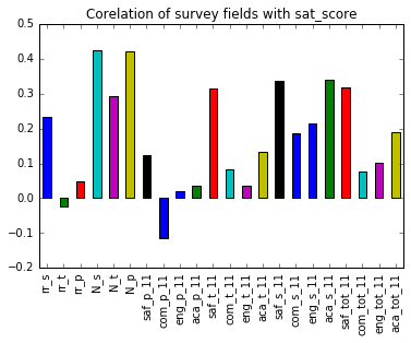
These are the observations
- There is some correlation between
N_s,N_t,N_pandsat_score. - Also
saf_t_11,saf_s_11,saf_tot_11are somewhat correlated to highsat_score. These correspond to how safe the teachers, students and both percieve the school to be.
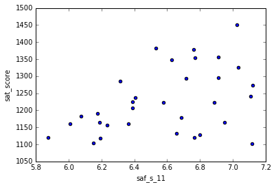
Exploring safety and SAT scores
combined.plot.scatter('saf_s_11','sat_score')
<matplotlib.axes._subplots.AxesSubplot at 0x7ff183751b70>

There is no clear correlation between the two variables, but one can notice that for some values, higher saf_s_11 corresponds to a higher SAT score. Possibly because more safe the student feels, he could concentrate more on the studies and give his best.
combined.head()
.dataframe tbody tr th {
    vertical-align: top;
}

.dataframe thead th {
    text-align: right;
}
Analysis of SAT scores by districts
combined['school_dist'].value_counts()
02    48
10    22
09    20
11    15
14    14
17    14
07    13
24    13
13    13
03    12
19    12
12    12
28    11
18    11
08    11
21    11
31    10
06    10
27    10
15     9
30     9
25     8
29     8
05     7
04     7
32     6
01     6
26     5
20     5
22     4
16     4
23     3
Name: school_dist, dtype: int64
#computing avg safety score of each district
avg_saf_dt = combined.groupby(by = 'school_dist').mean()[['sat_score','saf_s_11','lat', 'lon']]
avg_saf_dt.reset_index(inplace = True)
avg_saf_dt
.dataframe tbody tr th {
    vertical-align: top;
}

.dataframe thead th {
    text-align: right;
}
avg_saf_dt.plot.scatter('saf_s_11', 'sat_score')
<matplotlib.axes._subplots.AxesSubplot at 0x7ff183735128>
Here the trend is more clear. Students are generally scoring more in SAT in the places where they feel they are safe.
** However there are exceptions too.** Let us look at the geography.
latitudes = avg_saf_dt['lat'].tolist()
longitudes = avg_saf_dt['lon'].tolist()

from mpl_toolkits.basemap import Basemap
import matplotlib.pyplot as plt
# setup Lambert Conformal basemap.
m = Basemap(projection='merc', llcrnrlat=40.496044, urcrnrlat=40.915256, llcrnrlon=-74.255735, urcrnrlon=-73.700272, resolution='i')


m.scatter(longitudes, latitudes, latlon = True, s=50, zorder = 2, c=avg_saf_dt["saf_s_11"], cmap="summer")

m.drawmapboundary(fill_color='#85A6D9')
m.drawcoastlines(color='#6D5F47', linewidth=.4)
m.drawrivers(color='#6D5F47', linewidth=.4)
plt.show()
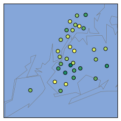
It looks like Upper Manhattan and parts of Queens and the Bronx tend to have higher safety scores, whereas Brooklyn has low safety scores.
Exploring Race and SAT scores
race_fields = ['white_per', 'asian_per', 'black_per', 'hispanic_per', 'sat_score']
race_corr = combined[race_fields].corr()['sat_score'][0:-1] # removing last element of sat_score
race_corr
white_per       0.620718
asian_per       0.570730
black_per      -0.284139
hispanic_per   -0.396985
Name: sat_score, dtype: float64
race_corr.plot.bar()
<matplotlib.axes._subplots.AxesSubplot at 0x7ff183775588>
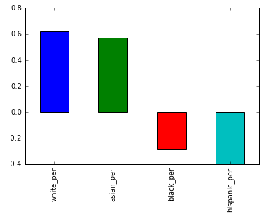
Observations
- There is a good positive correlation between the percentage of
whiteandasianstudents and SAT scores - Also, there is negative correlation between the percentage of
blackandhispanicstudents and SAT scores
These may also be related to demographic layout of certain districts. Like say, if a schools of a particular area are from a poor neighbourhood, where certain race population could be concentrated.
To explore further, let us analyse percentage of hispanic population vs SAT score
combined[race_fields].plot.scatter(x = 'hispanic_per', y = 'sat_score')
<matplotlib.axes._subplots.AxesSubplot at 0x7ff182eef240>
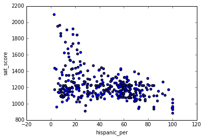
It does look like there is a negative correlation of SAT score with Hispanic percentages but it should also be noted that there are many schools in which the SAT scores were less but had very few hispanic students. Maybe it should be looked from geographic and economic situation perspective to get better insights.
# schools with ver high hispanic percentage
high_hispanic_per = combined[combined['hispanic_per'] > 95]
high_hispanic_per['school_name']
44                         Manhattan Bridges High School
82      Washington Heights Expeditionary Learning School
89     Gregorio Luperon High School for Science and M...
125                  Academy for Language and Technology
141                International School for Liberal Arts
176     Pan American International High School at Monroe
253                            Multicultural High School
286               Pan American International High School
Name: school_name, dtype: object
The schools listed above appear to primarily be geared towards recent immigrants to the US. These schools have a lot of students who are learning English, which would explain the lower SAT scores.
# schools with a hispanic_per less than 10% and an average SAT score greater than 1800
combined[(combined['hispanic_per'] < 10) & (combined['sat_score']> 1800)]['school_name']
37                                Stuyvesant High School
151                         Bronx High School of Science
187                       Brooklyn Technical High School
327    Queens High School for the Sciences at York Co...
356                  Staten Island Technical High School
Name: school_name, dtype: object
Many of the schools above appear to be specialized science and technology schools that receive extra funding, and only admit students who pass an entrance exam. This doesn’t explain the low hispanic_per, but it does explain why their students tend to do better on the SAT – they are students from all over New York City who did well on a standardized test.
Gender differences and SAT scores
gender_corr = combined[['male_per','female_per','sat_score']].corr()['sat_score'][0:-1]
print(gender_corr)
gender_corr.plot.bar()
male_per     -0.112062
female_per    0.112108
Name: sat_score, dtype: float64


<matplotlib.axes._subplots.AxesSubplot at 0x7ff181653c50>
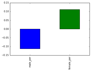
In the plot above, we can see that a high percentage of females at a school positively correlates with SAT score, whereas a high percentage of males at a school negatively correlates with SAT score. Neither correlation is strong and infact it is very less.
combined.plot.scatter(x = 'female_per', y = 'sat_score')
<matplotlib.axes._subplots.AxesSubplot at 0x7ff180b584a8>
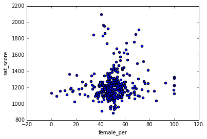
One can notice a cluster of high female percentages (60 to 80) and high SAT scores
# schools with a hispanic_per less than 10% and an average SAT score greater than 1800
combined[(combined['female_per'] > 60) & (combined['sat_score']> 1700)]['school_name']
5                         Bard High School Early College
26                         Eleanor Roosevelt High School
60                                    Beacon High School
61     Fiorello H. LaGuardia High School of Music & A...
302                          Townsend Harris High School
Name: school_name, dtype: object
These schools looks like liberal arts schools with admission tests etc. Possibly suggesting why female percentage is more and high SAT scores.
Does AP exam takers score higher in SAT exam ?
combined['ap_per'] = combined['AP Test Takers ']/combined['total_enrollment']
print(combined[['ap_per','sat_score']].corr()['sat_score'][0:-1])
combined.plot.scatter('ap_per','sat_score')
ap_per    0.057171
Name: sat_score, dtype: float64


<matplotlib.axes._subplots.AxesSubplot at 0x7ff180aa73c8>
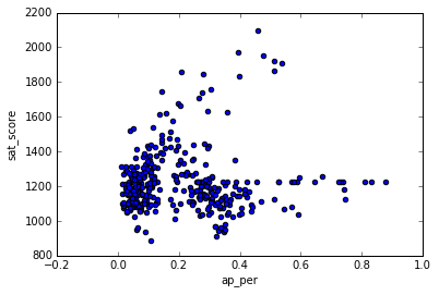
There is no correlation between AP exam and SAT exam takers. Thus it looks like taking AP exam maynot effect the student’s performance in the SAT exam
Bonus: Performance of Blacks and Hispanics compared to other races in SAT exam
Earlier we have seen that White percentage, Asian percentage were positively correlated with SAT scores where as Blacks and Hispanics were negatively coorelated
combined['white_asian_per'] = combined['white_per'] + combined['asian_per']
combined['black_hispanic_per'] = combined['black_per'] + combined['hispanic_per']
race_fields = ['white_asian_per', 'black_hispanic_per', 'sat_score' ]
race_corr = combined[race_fields].corr()['sat_score'][0:-1]
print(race_corr)
combined[race_fields].plot.scatter(x = 'black_hispanic_per', y = 'sat_score')
white_asian_per       0.724385
black_hispanic_per   -0.728650
Name: sat_score, dtype: float64


<matplotlib.axes._subplots.AxesSubplot at 0x7ff180a880b8>
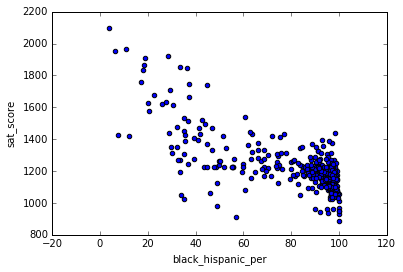
There is a strong negative correlation with percentages of black and hispanics with SAT scores. However it should be looked what financial background blacks and hispanics maybe from, where they would be residing etc, because all these factors may play a big role in SAT exam scores