Based on the data, one can see the relationship between various college branches or majors and the salaries of the graduates. Read on to find out % of women, STEM etc:- have any correlation on the salries of the gradutes.
Project: Visualizing Earnings Based On College Majors
We’ll be working with a dataset on the job outcomes of students who graduated from college between 2010 and 2012. The original data on job outcomes was released by American Community Survey, which conducts surveys and aggregates the data. FiveThirtyEight cleaned the dataset and released it on their Github repo.
Each row in the dataset represents a different major in college and contains information on gender diversity, employment rates, median salaries, and more. Here are some of the columns in the dataset:
Major_code- Major code.Major- Major description.Major_category- Category of major.Total- Total number of people with major.Sample_size- Sample size (unweighted) of full-time.Men- Male graduates.Women- Female graduates.ShareWomen- Women as share of total.Employed- Number employed.Median- Median salary of full-time, year-round workers.Low_wage_jobs- Number in low-wage service jobs.Full_time- Number employed 35 hours or more.Part_time- Number employed less than 35 hours.
import pandas as pd
%matplotlib inline

recent_grads = pd.read_csv('recent-grads.csv')
recent_grads.iloc[0]
Rank                                        1
Major_code                               2419
Major                   PETROLEUM ENGINEERING
Total                                    2339
Men                                      2057
Women                                     282
Major_category                    Engineering
ShareWomen                           0.120564
Sample_size                                36
Employed                                 1976
Full_time                                1849
Part_time                                 270
Full_time_year_round                     1207
Unemployed                                 37
Unemployment_rate                   0.0183805
Median                                 110000
P25th                                   95000
P75th                                  125000
College_jobs                             1534
Non_college_jobs                          364
Low_wage_jobs                             193
Name: 0, dtype: object
recent_grads.head()
recent_grads.tail()
.dataframe tbody tr th {
    vertical-align: top;
}

.dataframe thead th {
    text-align: right;
}
raw_data_count = recent_grads.shape[0]
recent_grads.dropna(inplace = True)  # dropping rows containing missing values
cleaned_data_count = recent_grads.shape[0]
print(raw_data_count, cleaned_data_count)
173 172
As one can see, one row with missing values has been dropped from our dataset.
Pandas, Scatter Plots
We will plot the scatter plot among various columns to understand the corelation between them
Scatter plot : Sample_size vs Median
ax1 = recent_grads.plot(x = 'Sample_size', y= 'Median',
                        title = 'Fig 1, Scatter plot : Sample_size vs Median',
                        kind = 'scatter' )
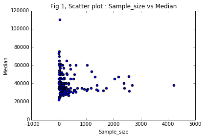
One can observe that there is no corelation whatsoever b/w Sample_size and Median. As the former increases, the latter is unchanged.
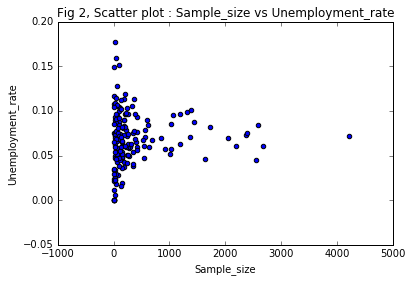
Scatter plot : Sample_size vs Unemployment_rate
ax2 = recent_grads.plot(x = 'Sample_size', y= 'Unemployment_rate',
                        title = 'Fig 2, Scatter plot : Sample_size vs Unemployment_rate',
                        kind = 'scatter' )
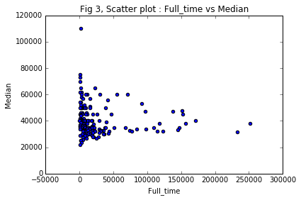
Scatter plot : Full_time vs Median
ax3 = recent_grads.plot(x = 'Full_time', y= 'Median',
                        title = 'Fig 3, Scatter plot : Full_time vs Median',
                        kind = 'scatter' )
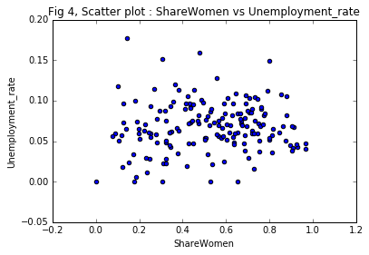
Scatter plot : ShareWomen vs Unemployment_rate
ax4 = recent_grads.plot(x = 'ShareWomen', y= 'Unemployment_rate',
                        title = 'Fig 4, Scatter plot : ShareWomen vs Unemployment_rate',
                        kind = 'scatter' )
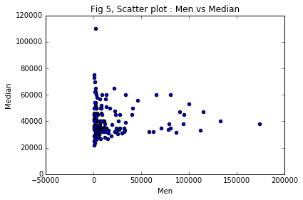
Scatter plot : Men vs Median
ax5 = recent_grads.plot(x = 'Men', y= 'Median',
                        title = 'Fig 5, Scatter plot : Men vs Median',
                        kind = 'scatter' )
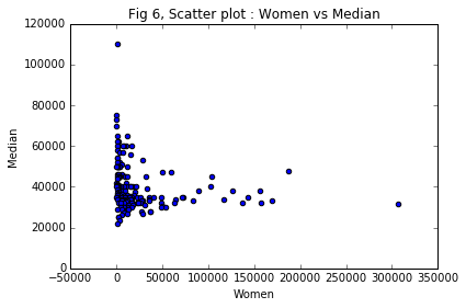
Scatter plot : Men vs Median
ax6 = recent_grads.plot(x = 'Women', y= 'Median',
                        title = 'Fig 6, Scatter plot : Women vs Median',
                        kind = 'scatter' )
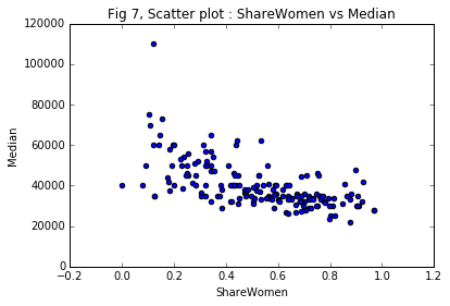
Scatter plot : ShareWomen vs Median
ax7 = recent_grads.plot(x = 'ShareWomen', y= 'Median',
                        title = 'Fig 7, Scatter plot : ShareWomen vs Median',
                        kind = 'scatter' )
Some questions based on the above scatter plots
-
Do students in more popular majors make more money? No, Fig 5 and Fig 6 imply that the median salary is not high for high number of men and women attending the courses
-
Do students that majored in subjects that were majority female make more money? No, Fig 7 says there is a negative corelation. As the shareWomen percentage increases, the median income drops.
-
Is there any link between the number of full-time employees and median salary? Even though the median income is very high for a lower full time employees, as the number increases the scatter plot mean is parallel to the
x-axissuggesting nocorelation later on
Histograms
import matplotlib.pyplot as plt
fig = plt.figure(figsize = (8,10))
fig.subplots_adjust(hspace = 0.5)
int_cols = ['Sample_size', 'Median', 'Employed', 'Full_time', 'ShareWomen',
            'Unemployment_rate', 'Men', 'Women']

for idx, col in enumerate(int_cols):
    title_str = 'Histogram of '+ str(col)
    ax = fig.add_subplot(4, 2, idx + 1)
    ax = recent_grads[col].hist(bins = 25)
    ax.set_title(title_str)
    ax.ticklabel_format(axis = 'x', style = 'sci', scilimits = (-1,1))

plt.show()
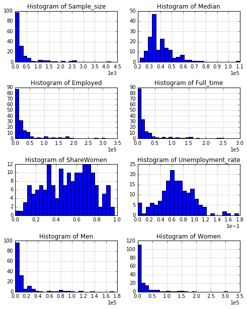
Using the above plots, we will try to explore the following questions:
What percent of majors are predominantly male? Predominantly female?
Refer the histogram of ShareWomen. If it is less than 0.5, it means the course is predominantly male. From the graph it can be observed that more than 60% of the courses are predominantly female
What’s the most common median salary range?
35k - 40k. Refer the histogram of Median
from pandas.plotting import scatter_matrix
scatter_matrix(recent_grads[['Sample_size', 'Median']], figsize = (10, 10))
scatter_matrix(recent_grads[['Sample_size', 'Median', 'Unemployment_rate']], figsize = (15, 15))
array([[<matplotlib.axes._subplots.AxesSubplot object at 0x7fa7910c63c8>,
        <matplotlib.axes._subplots.AxesSubplot object at 0x7fa791066908>,
        <matplotlib.axes._subplots.AxesSubplot object at 0x7fa790fde2b0>],
       [<matplotlib.axes._subplots.AxesSubplot object at 0x7fa790fa66d8>,
        <matplotlib.axes._subplots.AxesSubplot object at 0x7fa790f61780>,
        <matplotlib.axes._subplots.AxesSubplot object at 0x7fa790f2a9b0>],
       [<matplotlib.axes._subplots.AxesSubplot object at 0x7fa790ee6668>,
        <matplotlib.axes._subplots.AxesSubplot object at 0x7fa790eaf588>,
        <matplotlib.axes._subplots.AxesSubplot object at 0x7fa790ebd4a8>]],
      dtype=object)
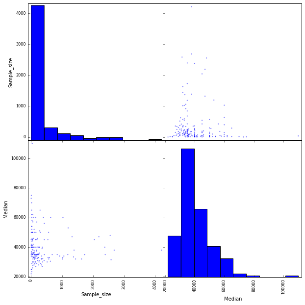
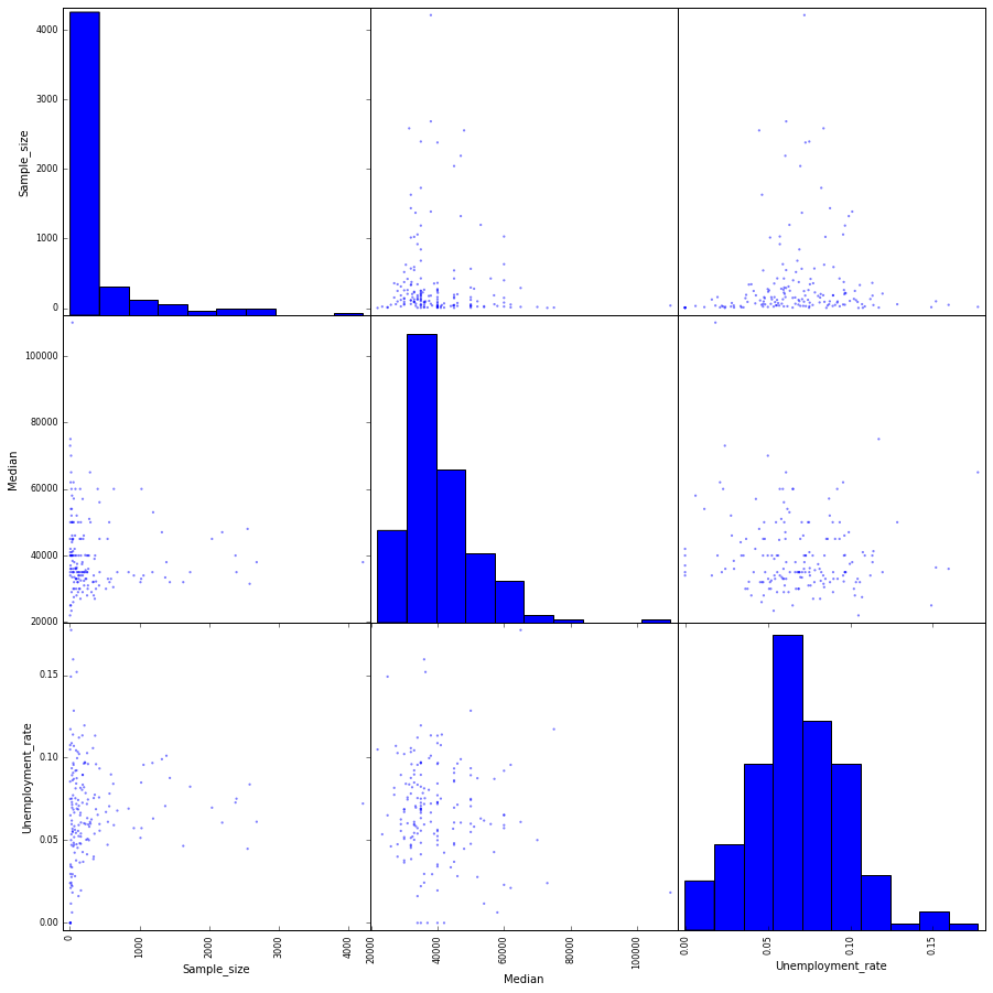
Ont thing is certain, there is no corelation between Sample_size, Median, Unemployment_rate. As a variable increases, the other variable doesn’t change.
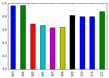
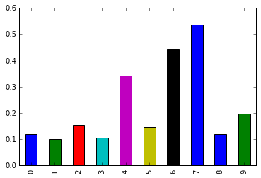
Bar plot to compare the percentages of women (ShareWomen) from the first ten rows and last ten rows of the recent_grads dataframe
recent_grads['ShareWomen'].head(10).plot.bar()
<matplotlib.axes._subplots.AxesSubplot at 0x7fa79062ce48>
recent_grads['ShareWomen'].tail(10).plot.bar()
<matplotlib.axes._subplots.AxesSubplot at 0x7fa78ec94898>